Ice Cream Sandwich adds some delicious upgrades, but it still requires a bit of a learning curve. We’ll walk you through the good, the bad, and the ugly of Google’s latest version of Android and provide some tips to get you all set up with the new OS.
After months of waiting, the Galaxy Nexus (and by extension, Android 4.0, aka “Ice Cream Sandwich”) is finally here. We’ve already done an extensive review of the hardware, so here we will be looking much more closely at Ice Cream Sandwich. Whether you are an Android veteran or a smartphone first-timer, this new version of Google's mobile operating system has a few things you should know about before getting started.
Ice Cream Sandwich (ICS) is the biggest update to Android since the OS launched, and the changes are pretty significant. They aren’t too dramatic for people used to Android, but people new to the OS may have some difficulties starting out. While Android 2.x was perhaps not the easiest OS to master, once you got the hang of it, it was rather straightforward. ICS, on the other hand, was designed to be easier to use, but even long-standing Android users will have to spend some time learning its ins and outs.
Here's one issue: Not all icons are clearly labeled, so it can be difficult to know what a button does in a particular app. The new Calendar app, for instance, has a small unlabeled square (it looks like a small calendar) that takes you to the present date. Other than pressing the button, you have no visual cues to tell you what that icon actually does. This isn’t the same Android that we’ve all come to know, but rather a new OS that carries on the Android legacy.
A Fresh New Look
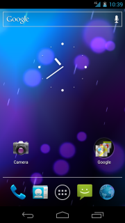
ICS is by far the most visually appealing version of Android that I have seen to date. The holographic interface in Android 3.0 (Honeycomb)has been passed on to ICS, though it doesn’t translate that well on a smaller display. On a tablet, the holographic interface looks as if it has some depth, but on a phone it appears extremely two-dimensional. ICS, however, adds a few new colors to Android’s repertoire, swapping out the old green and gray for a vibrant blue.
Text is also much easier to read thanks to use of the new high-resolution font Roboto. Roboto was designed to be used on HD displays, and is a massive step up from the old Droid Serif in Android 2.x. The font looks a lot cleaner than the one used on Honeycomb, and complements the holographic UI quite nicely.
One of the biggest interface changes concerns the use of software navigation buttons for Android smartphones. Pre-Honeycomb Android devices all used hardware buttons for basic navigation (Home, Menu, Back, Search), while software keys were exclusive to Honeycomb tablets. The Galaxy Nexus has a buttonless design, and chances are high that we will be seeing more Android phones that take advantage of ICS software buttons.
The software keys include Back and Home, with the Menu and Search buttons replaced by a Recent Apps button (more on that later). While software keys work fine on a larger-sized tablet, I was initially worried that the software keys in ICS would be too easy to hit by accident on a smartphone. Fortunately, this was not the case, and not once in my time with Ice Cream Sandwich did I ever accidentally exit out of an app because of any of the software buttons.
One issue I do have with ICS is centered on the nestled menus. Whereas in previous versions of Android the menus would all appear in the same spot, ICS has you hunting around the screen looking for the three dots that indicate a menu drop-down. Again, not a big problem, but it makes navigation inconsistent from one app to another. In general, it seems menus appear in either the top-right or bottom-right of apps, the exception being that older apps will have the menu icon appear down next to Recent Apps.
Features Galore
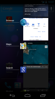
More than just a pretty face, ICS also adds loads of new features to the Android OS. As mentioned earlier, you now have a Recent Apps button that allows you to quickly jump from one app to another. When you press Recent Apps, a carousel with the last 15 apps you’ve opened will pop up. You can either tap an app to go to it, or swipe it left or right to close it. It works extremely well and quickly became one of my favorite things in ICS.
Another handy new feature is the ability to resize widgets to your liking. You do this by holding down a widget, then dragging the sides until the widget is as big or as small as you’d like it to be. Certain overlays andAndroid Honeycomb tablets have had this resizing feature for a while now, but for the first time, it's a built-in part of the native OS. Widgets have also been relocated to the app drawer, making them easier to find and easier to preview.
As I’ve elsewhere described, almost all of the core apps have received major redesigns. Gmail more closely resembles the desktop version, and it’s now much easier to attach photos and other files onto emails. Your inbox is also available for offline viewing (should you not be able to connect online), and a new context bar on mobile makes it easier to quickly compose new emails and delete the ones you no longer want.
The Calendar app was tweaked so you can view multiple Google Calendars at once, and now you can pinch to zoom in or out of events to see more details about them. The old Music app has been replaced with Google’s new Music app that is tied to its online music service. You can still play local files, but now you also have the option to stream content from your online music library to your device. And though it was just recently updated to support video chat, Google Talk now lets you sign in using multiple Gmail accounts. As someone who uses Google Talk on a daily basis, this makes it a lot easier to switch between my work account and my own personal Google Talk account. The Gallery can do some rather robust editing, and the camera now includes a very-easy-to-use panorama mode.
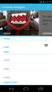
The Contacts app, now renamed the People app, got the biggest update. While the Contacts app in Android 2.x was a rather bland affair, the new People app is a colorful hub for keeping track of your friends and family. If you have a social networking app installed (like Facebookor Twitter), the People app will find your friends that also use that service and display their status updates on their contact card.
Unlike in previous versions of Android, the People app is not tied in directly to the Dialer. Instead, the app behaves like an address book and houses all of your contacts from across all of your services. The only concern I have is that Gmail automatically saves any email address that you send messages to as a contact in the People app.
Before you sync your Gmail contacts to your Android phone, I would recommend disabling this option on the desktop version of Gmail and purging any unwanted contacts that the service may have already created.
One last thing to note is that the People app does not contain the option to filter contacts based on those that have phone numbers. Instead, a filtered list of contacts with phone numbers can be found beneath one of the tabs in the dialer app.
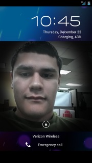
Face Unlock and Android Beam were two features that sounded great in theory, but in practice didn’t play out all too well. Face Unlock lets you unlock your phone by using facial recognition software, but it has one too many bugs to make it really useful. Face Unlock was difficult to use outside on sunny days, because bright sunlight obscures your face to the camera. Face Unlock can also be tricked by either a picture or someone who closely resembles you. An option exists to improve Face Unlock by having the phone identify you while wearing glasses, with or without facial hair, or while in different settings. Face Unlock is not an entirely foolproof security measure (Google even warns that it’s not as secure as a PIN or a lock pattern), but it’s still a novel way to interact with your phone.
Android Beam is supposed to make it easier to share data between devices using near-field communications (NFC). After several botched attempts, I finally managed to send my contact information to a coworker who also had a Galaxy Nexus. The instructions for Android Beam are quite vague, and it seems to behave differently in each app. To use Android Beam, you must first make sure the feature is turned on under the Settings. Once you’ve done that, open the app you’d like to send data from, and simply hold your phone against another NFC device to begin a connection. Your phone should make a noise to announce the pairing, and then you just tap the screen to begin transmitting content. I was unable to send a photo from my gallery, but otherwise the contact card transfer went off without a hitch. It’s another interesting piece of ICS that still seems to need a bit more work.
The Best Android Experience
Even with its quirks, Android 4.0 still provides one of the best Android experiences to date. Performance will vary from device to device, but overall it’s one of the most stable mobile OSs that I’ve ever used. ICS is fast, and in my time with it I never had anything crash or stutter during regular use. It just works. While I may not completely agree with all of the design changes in ICS, the update brings a level of polish that makes Android feel much more modern. It will be exciting to see the next generation of Android phones and tablets--and to see exactly how Ice Cream Sandwich will look and feel on them.


0 comments:
Post a Comment